Shinta Carolinasari
2017-07-24 12:58:25 UTC
Hi all,
I'm a casual user of Audacity and this software helped me a lot when
developing multimedia project, I love it!
I noticed Audacity is using Wordpress and using built in standard theme,
Since I do web design+development and also have experience on Wordpress,
so wondering if I can contribute to Audacity website?
I've tried to draw a design concept.. You can check below:
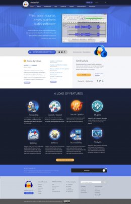
Design 1: Light variant
Loading Image...
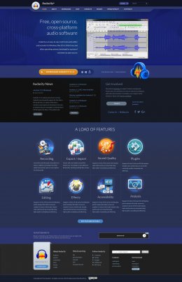
Design 2: Dark variant
Loading Image...
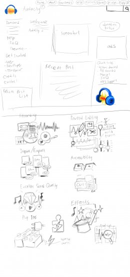
Bonus: Raw sketch
Loading Image...
So far it's homepage only, I haven't designed inner pages.. Would like
to hear from you in case you like it? Or have feedback or things need to
be improved?
Ideas:
-Keep elements on existing websites, but redesign it for more
polished/modern look.
-Keep using existing logo & use it as base of color theme.
-Big hero banner with screenshot. Supposed to show the screenshot to
attract especially new user.
-Prominent download button with clear indicator that this software is a
multi platform to drive more downloads.
-News area.
-Donate button and call for involvement.
-Show off the main features. Use shiny minimalist illustration icons.
-Ads.
-Responsive web design using mobile first approach + with recent web
standard.
How's your thought?
Thanks,
Bayu/Playmain
---
This email has been checked for viruses by Avast antivirus software.
https://www.avast.com/antivirus